
Garry Winogrand: Color at the Brooklyn Museum in New York is a photography exhibition quite unlike any other I’ve ever seen. Through a radical presentation as large-scale projections, Garry Winogrand’s remarkable, energetic and challenging color photographs come alive on the wall. The combination of Winogrand’s incisive and voracious eye with the rich and vivid color of the vintage slides allows the photographs to reach through time and space, in some ways even more powerfully than his classic, virtuosic black and white images. Even for those who know Winogrand’s work well, the depth and breadth of his color output is somewhat of a revelation. I fully expected to be enthralled, but I was still surprised by just how much it moved me. And like any newly revealed body of work by a great artist, Winogrand’s color work opens the door to many new questions about his relationship to the medium.
Garry Winogrand (1928-1984) was one of the most influential and important photographers of the 20th century. Though he rejected the label, he is known as a pioneer of street photography. For many, his work is still the archetype for that genre of image making: candid photographs made in public spaces without interacting with the subjects. He was also one of the most prolific photographers of the pre-digital era, with a total output of likely over one million photographs during his lifetime; when he died unexpectedly after a short bout with gallbladder cancer in early 1984, he infamously left behind thousands of undeveloped rolls of film, and thousands more that were developed or contacted but never viewed or edited. But until now, Garry Winogrand was essentially considered a black and white photographer. Of course, during his lifetime, he was just a photographer – no such distinction between color versus black and white had to be made, as the vast majority of art photography before the late 1970s was in monochrome. And before this show, his color work has mostly been considered just a footnote to his artistic legacy.
Although a small number of his color photographs have previously been exhibited and included in a few publications, the current exhibition, curated by Drew Sawyer with Michael Almereyda and Susan Kismaric, is the first comprehensive attempt to deal with his color work. It’s exciting any time a new and unseen body of work by an extremely influential artist is unearthed and exhibited for the first time, but what makes this show so special is that it literally adds an entire new dimension to his work. It’s as if a monochrome veil has been pulled back, revealing a previously unseen reality. The world that he was photographing comes alive in a new way.

Despite the fact that Winogrand’s color work has been considered “peripheral to his effort” (1) and represents only a tiny fraction of his total output, the overall quantity of color images that he shot and the large number that were presented in this exhibition demonstrate that it was no mere sideline. The curators sifted through the approximately 45,000 color slides held in the Garry Winogrand Archive at the Center for Creative Photography at the University of Arizona and chose over 450 for the exhibition. They are presented as projections in 8 roughly thematic sections that rotate through approximately 30-70 images each. The projections are large, and are spread across the walls of a single long room. In addition, the show includes a room with black and white prints from the Brooklyn Museum’s collection of some of Winogrand’s best-known images, and two screens showing approximately 10-minute edits of 8mm color movie film he shot on the streets of New York during the same period as the color slides.
Henry Wessel used the word “physicality” to describe the perception of light in a photograph – the way that light can exude a physical presence – and I think the same physicality of light is part of what makes Color so successful. Despite the mundane association with amateurish family slideshows, there is a certain visceral power to the projected image that sets it apart from a print, or a small backlit image on a computer or smartphone screen. It comes down to the fundamental meaning of photograph: if photography is drawing with light, then a projected slide literally redraws that light on the wall for the viewer. One could thus argue that a projected photograph, especially on a large scale, is one step closer to the experience of reality than the viewing of a framed print behind glass.

Beyond the physical experience, the choice to present the photographs as a projection also relates to the original intention with which they were made. Prior to at least the mid-1960s, the dominant type of color film was slide (i.e. transparency) film, which when processed, yields a positive image intended for projection. In contrast, the first Kodacolor negative film, which is developed into a negative that can be used to create positive prints, was only made available in the 35mm format in 1958 and was initially very slow and grainy; it did not become popular until much later. Although a number of processes existed to create prints from positive transparencies – most notably dye transfer – these processes were expensive, difficult, and not readily available. Therefore, when Winogrand created these color images, they were essentially intended to be viewed as projections. The only time he exhibited color work during his life, at the New Documents show at the Museum of Modern Art in 1967, the color photographs were displayed as projected slides (2). While I’m sure that terrific modern inkjet prints could have been made from scans of the slides, and Winogrand would likely have made color prints in the 1960s if he could, presenting them in such a way wouldn’t correspond to Winogrand’s intention when he made them. So in addition to the physical experience, the slideshow format confers an authenticity to the presentation of the work that adds to its resonance.
Beyond the unique presentation, the exhibition is significant because of the important questions it raises about Winogrand’s relationship to color, and the development of the medium in general. To understand the importance of Winogrand’s color work, it’s necessary to understand a bit about the history of color photography. There is a generally accepted history of color photography that goes something like this: up until the 1970s, art photography was in black & white. Color photography – which was technically very limited both in terms of film speed and accuracy of color reproduction – was considered to be vulgar (not in the modern sense of obscene, but the original definition of crude and ordinary). It was the medium of garish commercial advertisements and amateurish family snapshots. Then, in 1976 William Eggleston and John Szarkowski broke the field wide open with the show Photographs by William Eggleston at MoMA and the accompanying book William Eggleston’s Guide, and color finally took its overdue place in the art world. Meanwhile for Winogrand, color was an experiment; initially it was too technically limited and unforgiving, and once more flexible was still too expensive, especially given the volume that he shot.

Paul Outerbridge, Self Portrait, Santa Monica (1955)
But as with any one-paragraph historical summary, the reality was much more complex. Many renowned photographers used color – or at least experimented with it – as early as the 1940s. Eggleston’s 1976 show wasn’t even close to the first time that serious color work was shown in a museum context (3), and the controversy surrounding it is somewhat exaggerated. If anything, it was the MoMA curator John Szarkowski’s provocative promotion of Eggleston’s work as “perfect” that brought the debate about the artistic validity of color to the forefront, and ultimately hastened the embrace of color photography by the art world (4).

Collier’s Magazine, May 13, 1955
Specifically for Winogrand, there was a larger context for his color experimentation. Like many of his contemporaries including Lee Friedlander, Winogrand pursued his personal work while jobbing as a freelance photographer for magazines and in commercial advertising. He had to familiarize himself with color materials and techniques for some of these jobs, and his earlier color work appears to largely be an outflow from this assignment work. The other important context is the influence of his peers working on the streets of New York, particularly Joel Meyerowitz (5) and Tod Papageorge. I had the opportunity to ask Papageorge about Winogrand’s color work at an event at MoMA commemorating the 50th anniversary of the New Documents show. Papageorge told me, “we were all doing it,” and went on to equate Winogrand’s color work with his and Joel Meyerowitz’s own experimentation with color in the mid-1960s. Papageorge, in fact, recently published a book of his own color work from this period, Dr. Blankman’s New York, in which he explains that he started experimenting with color specifically to enhance his portfolio for advertising jobs.
But even understanding this context leaves a lot of unanswered questions about Winogrand’s color work: what was his motivation when making it? How did he view it in relation to his “main” black & white work? Why did he stop? On one hand, given the fact that it has been generally considered peripheral to his oeuvre, his color output is surprisingly vast. 45,000 slides (about 1250 rolls of film) and a full 100 out of the 500 rolls exposed during his Guggenheim grant trip of 1964 – which has been considered a pivotal year for him (6) – is certainly no trivial amount.
On the other hand, given that he shot that much color – and therefore, obviously approached it seriously – it’s surprising to me that he didn’t do even more. In a conversation with Jay Maisel, Winogrand suggested that the primary factor keeping him away from color was technical – he would not be able to deal with the volume of work he was creating if he worked in color (7). He implies that if color media were as facile as black & white, he might be shooting in color. Yet this wasn’t the case, because by the last few years of his life, color negative film had become just as flexible as black and white. It was available in higher speeds comparable to black and white, and chromogenic (type C) prints could be made almost as readily as silver gelatin black and white prints – not that Winogrand was really involved in printing much at that point anyway. And yet, it doesn’t appear that he shot any color at all after the late 1960s.


And that’s the essential mystery of the exhibit, and really an unanswerable question. What was he thinking when he was shooting color in the 1950s and 1960s? Was it just practice to gain familiarity and ease with the materials? Did he consider it a separate body of work from his primary black and white output? I also wonder about the practicalities of how he approached color during this period. There are clearly instances when he carried two cameras, one loaded with black and white and one with color. How often did he do this? Why did he shoot certain scenes with both? Were there any periods when he only shot color? And again, why did he stop?
Although Winogrand is sadly no longer around to answer these questions for us, I do have some suspicion as to the answer to the last one, at least. Given that his early color photographs seem to have been an outgrowth from his commercial work, I think he probably continued to associate color with his commercial life. During the late 1960s Winogrand transitioned away from commercial and assignment work, instead making a living through teaching and selling prints and books; in other words, he evolved from a freelance photographer who made personal work into a full-time artist. I surmise that he saw the color work as a vestige of his commercial life, and it probably lost some of its appeal as he developed in his artistic practice. As Mitch Epstein, who studied with Winogrand at Cooper Union in the 1970s, recently recounted (8):
Garry made a sharp cut between the period when he was doing commissioned commercial work in the ’50s and 60s, and what followed in the 70s, when he taught photography and devoted himself to his art. I think he had some reticence [to shoot color] because color was bastardized by its exploitation in advertising, or at least that was the perception of it in his circle.
This transition also coincided with a gradual but steady increase in the volume that he shot each year (9), and despite color media becoming more flexible it probably made sense for him to stick with the familiar materials of black and white as his output swelled. By the time that contemporaries like Meyerowitz and Eggleston fully embraced color in the 1970s, he had long abandoned it and probably felt little reason to go back. There may have been other minor factors involved. At some point during the 1967 New Documents show at MoMA, the slide projector showing his work infamously malfunctioned and caught on fire, destroying some of his slides; the projector (and thus the color work) were removed (10). Although a seemingly trivial incident, I can imagine that it had a symbolic impact on Winogrand’s perception of the importance of his color work.


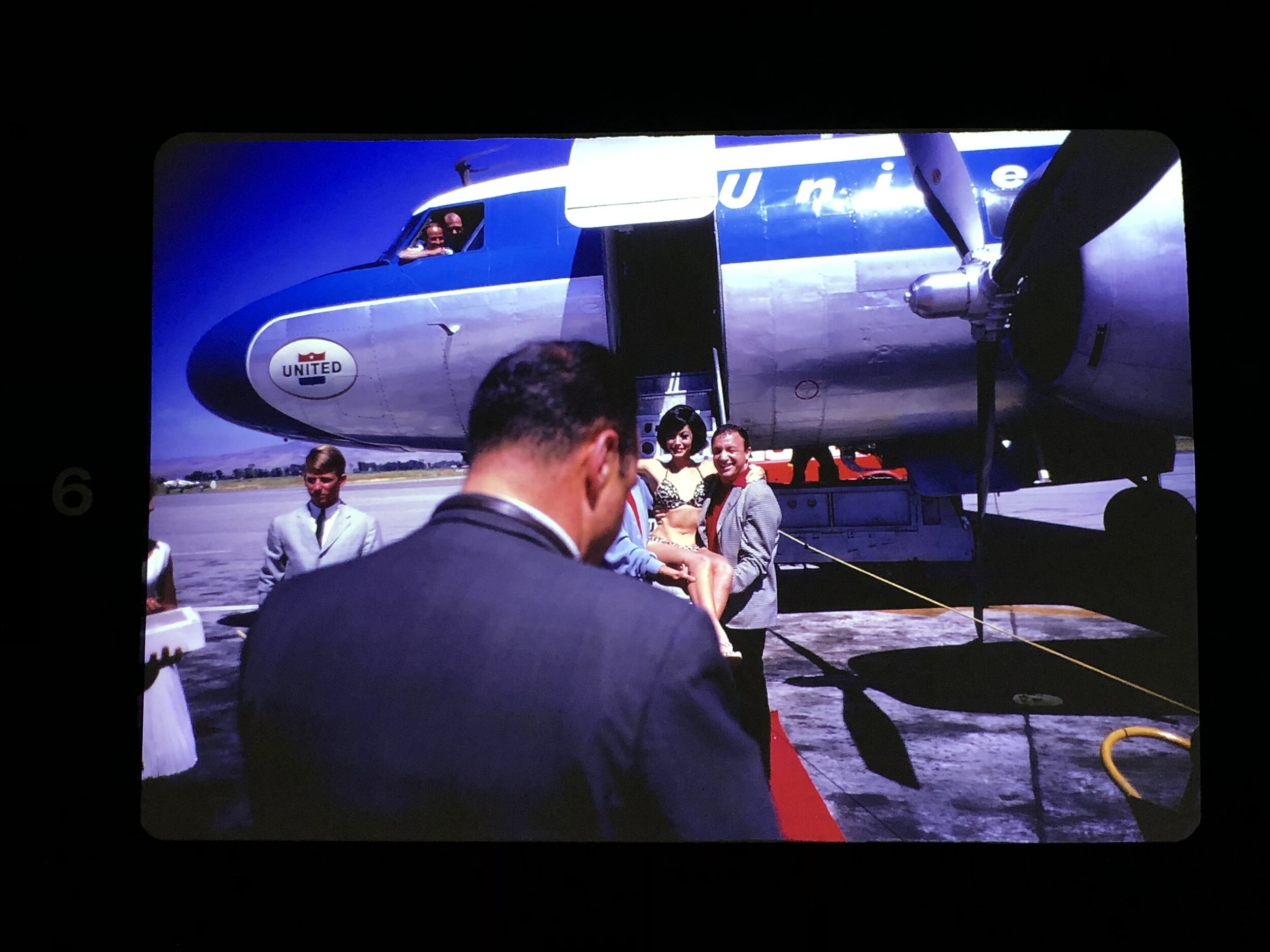
But now that we understand a little bit more about the context, let’s get back to the matter at hand, and talk about the pictures in Garry Winogrand: Color. Although the curators separated the work into 8 sections, my perception is that the pictures fit into four basic categories: offshoots of commercial and magazine work, color experimentation, work made during the Guggenheim road trip in 1964 (and possibly other travels), and work that is generally identical to his classic 1960s New York City-based photographs, but in color.


The first category, offshoots of commercial work, is distinguished by both the subject matter and the aesthetic qualities. In some instances, there is a recognizable celebrity subject, such as Chet Baker or Eartha Kitt. Many are taken indoors or at night, while a substantial portion are taken in and around the beach at Coney Island. Even when taken out in public, there tend to be fewer subjects in the frame than in his classic work. From a technical perspective, these pictures are often made with longer focal length lenses. This is true of Winogrand’s black and white work as well, in which he appears to have gradually transitioned from a 50mm to a 35mm and/or 28mm; however, the earlier color work, especially from Coney Island, employs a longer telephoto focal length which is otherwise rare in Winogrand’s work. Ultimately, to me, the object of these photos is experimentation with materials and techniques – learning how to use color, finding out how it works, and utilizing it in situations where its poor sensitivity to light (and requirement of slower shutter speeds and/or wider apertures) was less of a limitation.


This spirit continues in the work that I categorize as color experimentation. This group of pictures often includes no people, and revolves around the color content more explicitly. The photos often focus on smaller details or simpler subjects than the complex frames more typical of Winogrand’s best known work, and often include large swaths of bright color. There is more emphasis on texture, light, and surface than on gesture, movement, or layers. In some way, these photographs relate more to the work of photographers like Eggleston or Saul Leiter than they do to Winogrand’s classic work. In these photographs, Winogrand is experimenting not with how color materials work, but with how color works in a photograph – how it conveys meaning.
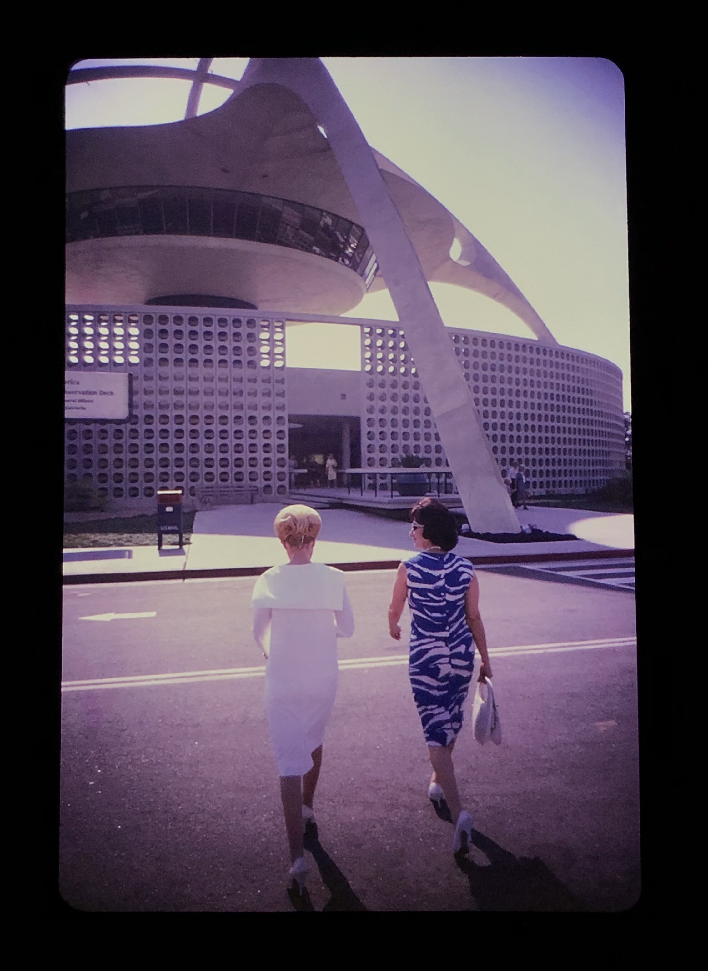
The other two categories relate much more closely to Winogrand’s primary work from this period. It seems clear that Winogrand’s most committed attempt to incorporate color into his work occurred during 1964, when he traveled around the country on a Guggenheim grant. Although the work from this year was not published comprehensively until 2002 in the book Winogrand 1964, he made many of his most famous photographs that year, and the photographs from 1964 formed the backbone of his work included in New Documents in 1967 (11) and remained important throughout his career. A handful of color images were included in Winogrand 1964, but Garry Winogrand: Color demonstrates for the first time just how significant the color work was to his endeavors that year. It is unknown why he took up color in such a significant way during that period. I imagine that he felt somewhat liberated by the grant and free to experiment. Perhaps he saw it as an opportunity to more deliberately reckon with the question of color in his work, to find out whether he saw it as a worthwhile pursuit. And he probably felt that some the subject matter he would be dealing with on the trip – scenic national park landscapes, state fairs, civic celebrations – would benefit the most from the extra dimension that color offered.

Lastly, there are the photographs which I would characterize as essentially similar to Winogrand’s main New York-based work of the period, both aesthetically and in subject matter, but made in color rather than black and white. Although these are the most similar to his well-known work, I found them to be the most striking and memorable images of the entire show. It is precisely because they are so closely related to his best-known work, and simultaneously so different. It’s as if Winogrand’s work had a monochrome filter on it that was suddenly removed, and the world that is seen in his photographs – the Mad Men realm of New York in the early 1960s – came back into existence. The colors are saturated, yet subtle. Red neon signs, blue uniforms, yellow cabs, orange and brown skin tones, and the deep shadows characteristic of slide film. These pictures aren’t about the color, they’re about life. But the color adds an entirely new layer of intensity and meaning, in its best moments a more visceral and unflinching depiction of the gritty 1960s New York streets than even Winogrand’s classic black and white work.

Of course, the show is not without problems. Most of these have to do with the categorization and labeling rather than the photographs themselves. Although the show establishes the relationship between Winogrand’s use of color and his commercial and magazine work, I think it’s a mistake to mix these images in with his personal work. It’s impossible to say what belongs where, but there are several portraits of musicians and an image from the set of the Marilyn Monroe film The Seven Year Itch which are almost certainly assignment work. Although interesting pictures, I think Winogrand would have scoffed at the inclusion of such photographs alongside his personal work. The same choice was made in the recent documentary All Things Are Photographable (which included some of the same images); while the pictures are worth seeing, perhaps it would have been better to present them separately as a prologue, because I think Winogrand himself would have strongly distinguished between personal and assignment work.

I also think that the curators unnecessarily politicized the work by including a category entitled “White Masculinity.” There has been a recent trend to recontextualize potentially problematic work in the museum setting, but in this case it feels arbitrary – provocative for its own sake, not because the work demands it. The text accompanying the exhibition makes the argument that white men in suits and in cowboy outfits were recurring archetypes in Winogrand’s work. However, when I look at his work (even just the subset of work in this show) I see a much broader inclusion of men and women of many races, occupations, and styles of dress – and many of his most celebrated photographs focus on people of color. If there is a predominance of white men in suits it’s because they are the people who were in midtown Manhattan during the daytime in the years Winogrand was shooting there.

On the other hand, it was reasonable to include a section with photographs of women. Winogrand’s photographs of women and his exploration of the male gaze are important elements in his work, most notably expressed in his book Women Are Beautiful. While the controversy surrounding that book is overblown, his photographs of women do form an important thread throughout his work. But unfortunately the edit of this section in Color is rather arbitrary and includes many pictures that happen to be of women, but depict somewhat random scenes such as parades; the selection therefore fails to add much to our understanding of Winogrand’s point of view towards women in his work.
So then, what of Winogrand’s use of color? What does Garry Winogrand: Color show us? I think there are three basic categories of color photographers: those who ignore color as a specific issue and shoot the world as it is, with the color falling into place on its own, those who specifically look for colors and integrate them as graphical elements, making the photograph about the color, and those who manage to incorporate color into the picture in such a way that it becomes integral to its meaning and inseparable from its content or form. Photographers who show the world, as John Szarkowski so eloquently said about William Eggleston, “as though the world itself existed in color, as though the blue and the sky were one thing.” At its best, I would put Winogrand’s color work in this category. Mitch Epstein demonstrated Winogrand’s understanding of this issue in recounting Winogrand’s mentorship as he took up color. “He didn’t want me treating color like a trick pony.” Epstein recalled. “He viewed it, instead, as intrinsic to the form and content of a picture (12).

Ultimately, Garry Winogrand: Color achieves several things. It adds to our collective understanding of a great artist, and it deepens our appreciation of Winogrand’s pursuit of photographic challenges and his desire to push boundaries. It provides a vivid glimpse of a long-lost world through the witty and incisive eye of a virtuosic image-maker. And it generates a visceral experience unlike almost any other exhibition of photographs. Fundamentally, it demonstrates the power of great art; although Winogrand died 35 years ago and made most of the pictures in this show over 50 years ago, the revelation of this unseen chapter of his work is incredibly powerful, and instantly moving. He reaches through time to allow us to see, to let us understand, and to make us feel.
The photograph is literally an emanation of the referent. From a real body, which was there, proceed radiations which ultimately touch me, who am here; the duration of the transmission is insignificant; the photograph of the missing being … will touch me like the delayed rays of a star.
-Roland Barthes, Camera Lucida (13)
1. Leo Rubinfien, Erin O’Toole, Sarah Greenough. "Introduction," in Garry Winogrand, ed. Leo Rubinfien (New Haven: Yale University Press, 2013), 10.
2. Drew Sawyer, Garry Winogrand: Color (New York: Brooklyn Museum, 2019), 4.
3. Katherine A. Bussard, “Full Spectrum: Expanding the History of American Color Photography,” in Color Rush: American Color Photography from Stieglitz to Sherman, ed. Katherine A. Bussard & Lisa Hostetler (New York: Aperture, 2013), 4-5.
4. Reva Leigh Main, Eggleston, Christenberry, Divola: Color Photography Beyond the New York Reception (Riverside: UC Riverside, 2016), 5.
5. Meyerowitz’s relationship with color photography is unique, and I feel he deserves special mention in any analysis of Winogrand’s color photographs. Although he was 10 years younger than Winogrand and in many ways a protégé, I think it’s quite likely that Meyerowitz, as his own enthusiasm for color and his commitment to it developed, had some influence on Winogrand as well. Unlike Winogrand and Papageorge, Meyerowitz somewhat innocently started out with color in 1962, before reverting to black and white after meeting Winogrand and facing his growing desire to be able to make prints of his work. Although it appears that the majority of Meyerowitz’s work from the mid-1960s to the mid-1970s is in black and white, he continued to work in color with a keen intention. He would sometimes carry two cameras, one with black and white film and one with color; when a scene in front of him was static enough to allow it, he began to experiment with taking nearly identical pictures in both forms, in order to compare them. When I noticed several instances in Color in which Winogrand did the same thing, I suspected that at least some of this impetus came from Meyerowitz.
6. Trudy Wilner Stack, "Garry Winogrand and the Year That Was," in Winogrand 1964, (Santa Fe: Arena Editions, 2002), 274.
7. Sandra S. Phillips. "Considering Winogrand Now," in Garry Winogrand, ed. Leo Rubinfien (New Haven: Yale University Press, 2013), 410.
8. Clara Malley, “Photographer Mitch Epstein on the incisive eye of his mentor Garry Winogrand,” Document, May 9, 2019, https://www.documentjournal.com/2019/05/photographer-mitch-epstein-on-the-incisive-eye-of-his-mentor-garry-winogrand/
9. Leo Rubinfien. "Garry Winogrand’s Republic," in Garry Winogrand, ed. Leo Rubinfien (New Haven: Yale University Press, 2013), 46.
10. Sarah Hermanson Meister. "Newer Documents," in Arbus Friedlander Winogrand New Documents, 1967, ed. Sarah Hermanson Meister (New York: The Museum of Modern Art, 2017), 410.
11. Wilner Stack, "Garry Winogrand and the Year That Was," 274.
12. Mitch Epstein, “Garry Winogrand’s illusive color photography receives its due at the Brooklyn Museum,” Document, May 7, 2019, https://www.documentjournal.com/2019/05/garry-winogrands-illusive-color-photography-receives-its-due-at-the-brooklyn-museum/
13. Roland Barthes. Camera Lucida, (New York: Hill and Wang, 1980), 80-81.
Copyright © Sebastian Siadecki, 2019